Law Firm Marketing Mistakes
In the past few articles, we discussed some of the many ways that law firms can market their firms, improve their positions in search engine results pages, and increase brand awareness. In this article we are going to take a different and somewhat lighthearted look at several firms that are missing opportunities to increase their digital market share. We start with the first considerations when developing a website (design, information architecture, and the user experience) and show you exactly how to fail at all three.
Randolph & Fischer


Aside from the fact that the banner image conveys absolutely nothing of value to the potential client, I’m not sure the bodybuilder image does anything to enhance his image as an attorney.
If he feels he has to promote bodybuilding, he could always write articles for the appropriate outlets and simply link to his website. A law firm website should be dedicated to all thing law, not all things lawyer.
The firms mobile site lacks the images, but is also all about the attorney instead of how he helps clients. No thought was given to the user experience and how to make the most of the few seconds a visitor would stay on the site.
Wachtell, Lipton, Rosen & Katz (http://www.wlrk.com)


The firm has wasted every inch of real estate on their page. Visitors should never have to click around in an attempt to see what services you offer. Since their image is literally the entire page, it should at least offer some sort of insight into the company or their offerings. Their mobile site makes the same mistakes. The vagueness of the site is akin to someone in a crowded room stating aloud, “Wachtell, Lipton, Rosen & Katz” for no reason. Awkward.
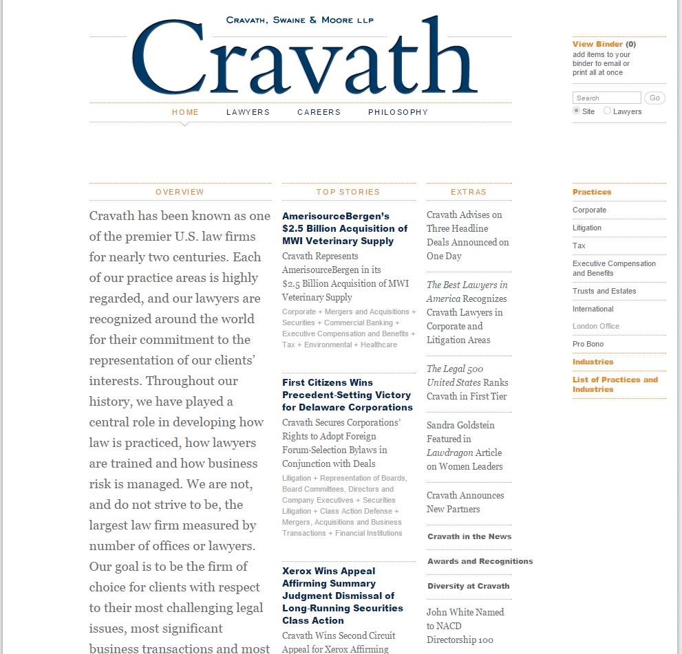
Cravath, Swaine & Moore LLP (http://www.cravath.com/)

Though this design could really work for a blog, as a website it misses a few very important opportunities. Visitors to the site will have to search around to see what type of firm they are looking at. The site is busy and is not intuitive, in fact, more thought has gone into presenting as much news as possible about the firm on the homepage, instead of focusing on services and clients. The firm does not provide a mobile friendly version of their site.
Sullivan & Cromwell LLP (http://www.sullcrom.com/)
Again, there doesn’t seem to be very much thought going into the user experience of this site. I admit I used this example because the gallery image is pretty fun and it shows a little personality, which is good, but the content does nothing to inform me of their services or focus. Practice areas, contact information, client solutions, testimonials, and achievements could take the place of the memos and news sections, which should be moved to dedicated pages deeper in the site. These changes alone would improve the user experience by leaps and bounds.
Rachel A. Runnels, Attorney at Law (http://www.runnelslaw.com/)
Runnels’ homemade website serves as little more than a placeholder on the web. The attorney writes she is semi-retired, which could be why she isn’t attempting to promote her services. Really, there is no point to the website, and odds are she has had very few potential clients connecting with her through the website. This website does not help the attorney’s image and is probably doing little in the way of bringing potential clients to the door.
Attorneys who aren’t willing to build a useful website, and one that can be marketed and promoted on the web, should probably just not publish one, especially when poorly designed websites can hurt your image and reputation.


Comments
Wonderful review with salient points as well. These make the marketing points really powerful & easier to understand. Merely saying don’t use or do this or that, without the why for, doesn’t make a very good power or selling point for me. Your illustrations really brings your information to life! Thank you again,pl Teresa.
Helen Strasko
Leave a Reply