Kick Ass Contact Us Pages
 Contact Us pages are often overlooked as a valuable opportunity to engage with your audience. They are generally the second highest visited page on a website and can convince a potential client to engage with you. Make sure your firm gives this page the attention it deserves.
Contact Us pages play several roles. They’re a consumer resource that allows your clients to reach the office or attorney they need. They also play a big role in qualified lead generation and help build potential client trust.
For your contact page to successfully play each role, there are certain things it must do:
- Function – the form(s) you use on your page must work as intended. If it fails to function the way the user expects, the user probably won’t be back.
- Appeal to your visitors – Your potential clients feel like they are taking a big step in the decision- making process when they contact you. If your contact page doesn’t make them feel like you understand that making contact is an important step, you may lose them.
- Not ask for too much information – Your visitors don’t want to try to explain things to you through a contact form, nor do you want them to. Make sure your content reflects this too.
- Provide feedback – Let your users know their contact was received and when and how they can expect a reply from your firm. Don’t leave them hanging once they’ve reached out to you.
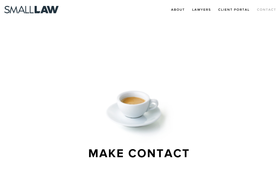
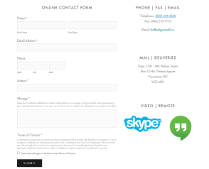
Here’s an example of one of my all-time favorite Contact Us page: Small Law
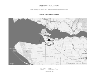
Small Law’s minimalist design really works for me, as does the color scheme and the page length. I like that the map is last because I always have trouble scrolling past the map, hitting it instead and either zooming in too close or swiping into a different state. I like that Skype and Hangouts are bright against the rest of the page, and I really dig the darn cup.
These are some of the other contact page designs that I find inspiring. Click the firm name to go to the homepage or click the image to see the full page.
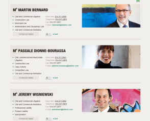
With the warm background the images really pop. The card look is a great way to provide tons of information in an easy-on-the-eye organized manner. This is by far one of my favorites.
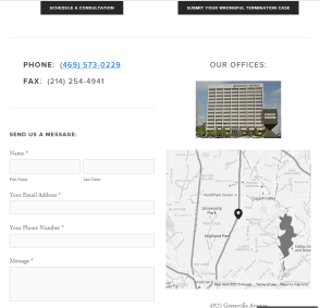
Tremain Artaza streamlines the contact process by providing general contact information and a message form, as well as a Schedule a Consultation button and a button to Submit Your Wrongful Termination Case. They also provide their social media connects, making it a highly effective design.
The group also has a minimal design theme that they pull off well. And the contact page, beyond what I captured and posted here, includes all their social media connects also, making it very easy for potential clients to connect with the firm in the way they are most comfortable with.

Leave a Reply